Live forex chart for binary options. Binary options charts
A convenient and free trading tool for working with binary options or Forex - a live online quote chart. It is a kind of diagram reflecting price movements in the foreign exchange market. Using it, you can track market trends, conduct analytics, and compare quotes with those provided by the broker. A live chart in real time shows the buying and selling rate of a particular currency pair. It can be used without registering or installing additional programs (such as Metatrader4 or 5) on your computer. By default, the graph displays Moscow time, half-hour candles and the euro-dollar currency pair.
Attention! Live schedule for mobile devices not intended and does not reflect correctly on them!Benefits of a live schedule
In addition to the above, the tool has the following advantages:
- Displays real-time quotes from multiple providers (FX, IDC, OANDA);
- A modern platform written in the HTML5 programming language ensures accurate chart operation without delays;
- High speed of displaying price changes (delays may be caused by low Internet connection speed);
- Simplifying understanding of the financial market through graphical display;
- Ability to adjust the plotting;
- The presence of main indicators for finding successful entry points into the market.
Live schedule for binary options with indicators – indispensable assistant for technical analysis by a trader.
How to use the live chart
To properly use a live Forex chart you need to adhere to a certain sequence works:
| 1. Selecting the asset for which trading is planned. | The EURUSD pair is considered classic. A potential trader can select any other instrument by entering its name in the box English. But by default, the live chart displays EURUSD online. Simultaneously with selecting an asset, you must also select a quote provider (in the drop-down list on the right). On at the moment(2017) the most accurate quotes are provided by OANDA. |
| 2. Selecting a time period. | When you select a time period, the graph will divide the information into the specified time periods. For example, the selected interval is 1 minute. On the chart, each new candle or bar will represent minute segments. Binary options traders like to use short time frames, Forex traders prefer long periods time - day, week, month.  |
| 3. Selecting the graph type. | There are 10 graphic types to choose from, but the most visual ones are candlestick charts (Heikin-Ashi, Japanese or hollow). Bars are the oldest form of displaying price movement on the market, but difficult to understand for beginners. Line and Area are twin sisters; they are used more to determine the direction of the trend and search for peaks and troughs. Renko and Kaga charts, Tic Tac Toe, Line Break are rarely used by beginners and are more like a game application to a live chart.  |
| 4. Selecting an indicator. | Unfortunately, you can’t tell everything about indicators on a live chart. But of the many indicators presented for technical analysis, it is better for beginners to use the Donchan Channel. Bollinger Bands, moving averages or stochastic oscillator.  |
| 5. Selecting drawing tools. | They are used to draw figures and trend lines and determine support and resistance levels: Crosshair – allows you to fix the cursor at the selected point. |

- On one computer, open the chart itself and the broker window simultaneously; for this, the monitor is divided into two parts,
- Connect your smartphone to work,
- If the chart does not open on your computer, your browser may be outdated.
If the live chart of the euro dollar or any other pair is not moving, check if it is a day off?
Attention: exchanges around the world are closed on Sat and Sun!
Let's look at the most popular binary options charts:
- Line graph
- Bar chart
- Candlestick chart
Now let's explain each chart for analyzing and forecasting asset movements, individually, and see what you need to know about each of them.
Binary options line chart
A simple line chart looks like a line from one closing price to the next closing price. If we draw a dot between these two points, we can see general trend movement of the price of a currency pair over a certain period of time. The chart of an option, or rather the price of an asset, shows the price in each unit of time. This chart is convenient to use to determine the trend (direction of the asset price). In combination with binary options indicators, such as moving averages, you can build options trading strategies on the chart.
Example of a line chart for EUR/USD:

The Bar Chart is more complex. It shows the opening and closing positions, as well as the positions above and lower price for a certain period of time. Bottom part the vertical bar indicates the lowest price that was during trading for a certain period of time, and the upper part of the chart indicates the highest high price, which was paid.

The bar itself indicates the trading range of the price of the currency pair as a whole.
The horizontal straight line on the left of the bar indicates the opening price, and on the right - the closing price. Here is an example of a bar chart for EUR/USD:
It should be noted that throughout our lesson you will not see the word "column" in relation to the data presented on the graph.
A column simply represents a specific time segment, such as day, week, hour. When you see that the word “column” is used as the main word, then immediately translate for yourself - time period.
Binary options bar charts are also called “OHLC” charts as they indicate the open, high, low, close for a particular currency. Here is an example graph with columns:
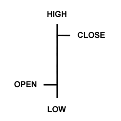
- Open: The small horizontal line on the left indicates the opening price
- Higher: Upper part vertical line determines the highest price for the time period
- Below: The bottom of the vertical line determines the lowest price for a certain time period
- Closing: The small horizontal line on the right is the closing price
Binary options candlestick chart
Candlestick charts provide the same price information as bar charts, but in a more elegant graphical format.
Candles indicate a spectrum from high to low value vertical line.
However, in candlestick charts, the large blocks (for the body) in the middle indicate a spectrum between the opening and closing price. Traditionally, if a block is in the middle, filled or colored, then the closing price is higher than the opening price.
IN following example, fill color is black. In a filled block, the top of the block is the opening price, the bottom of the block is the closing price. If the closing price is higher than the opening price, then the block inside will be white, or blank, or unified.
For example, we don't like traditional black and white candles. They just don't look that pretty. And since we spend a lot of time looking at candles and charts, it’s easier for us to look at those charts that are colored in different colors.
Color television is much better than black and white, so why not colorize it? different colors candlestick charts?
We simply replaced white with green and black with red. This means that if the closing price is higher than the opening price, then the candle will be green.
If the closing price is lower than the opening price, the candle will be red.
In our further lessons you will see how you can use red and green candles, how they will give you the ability to read charts much faster, for example, see a downward or upward trend, possible turning points.
For today, just remember that in options charts we simply use green and red candles instead of black and white, and from now on we will use them.
Here is an example candlestick chart for EUR/USD. Beautiful, isn't it?

The purpose of the candles- serve as a visual aid only, as the same information is provided in the OHLC column graphic. The advantages of candles are as follows:
Candles are easy to interpret, This good way For beginners, start learning how to analyze binary options charts.
Candles are easy to use! Your practical eye will immediately see the information on the columns. Plus, research shows that visual information helps with learning, so it likely helps with trading too!
Candlesticks are good for identifying turning points in the market- the reverse movement from the upward movement and transition to the downward movement, or vice versa, the downward movement turns into an upward movement. You will learn more about this later.
Now that you have learned how cool candles are, it’s time to tell you that we most often use candles for trading binary options.
In binary options trading, the most popular is the candlestick chart. However, we believe that the chart should correspond to the binary options strategy you are trading. If you don't use candlesticks in your analysis of an asset's price, you don't have to use them.
On our portal you will find a live binary options chart.
On this page I have posted a live chart for binary options. This means that asset price quotes change on it in real time. By the way, many traders have noticed that such a chart moves a little faster than its counterparts from brokers’ trading platforms. But don’t delude yourself, the difference is only a fraction of a second, and I wouldn’t recommend using them to make deals.
Using a live chart is not difficult at all. The main one is the top horizontal panel. In its leftmost window, select the desired asset. These can be currency pairs, shares of leading companies, country indices, futures, commodities, precious metals, and even cryptocurrency (Bitcoin). A little to the right, a time frame is selected - a time period indicating the duration of one bar/candle. On the same panel, you can open a list of auxiliary tools, called indicators, and connect their graphics. IN total number, more than 50 different indicators are available to the trader. And in the very right window you can choose one of 10 types of chart display, each of which I described in detail on the pages of the site.
The left vertical panel is a set of tools for advanced traders who independently draw lines and figures on the chart. To be honest, I myself have almost never used these tools, with the exception of constructing support and resistance lines, as well as Fibonacci levels. And even then, I used the last tool only for the sake of writing a training article for the site. In general, if you learn to use the tools from the left panel, this can be very useful in the trading process, and as a result, increase the number of positive transactions.
Signals for live binary options chart
On the pages of my website I also posted free signals, which will serve as an excellent auxiliary tool for a live chart. If you are not aware, signals are automatic alerts that indicate to a trader the right moment to buy a particular asset. Most signals work based on technical analysis data, such as indicators. Therefore, their indicators will save you from having to configure the tools yourself.
Signal indicators, as well as live chart quotes, are updated online. But I wouldn’t recommend relying on them entirely—first of all, conduct a market analysis yourself, and only then check the data from automated bots. By the way, another great tool for fundamental analysis will serve as an economic calendar. It marks all the most important events that can directly or indirectly affect the rates of a particular asset.
One of the trader’s main tools when working on financial markets is a live chart. After all, using it you can not only track quotes of a particular underlying asset, but also make certain assumptions regarding future price fluctuations.
Online chart of the EUR/USD currency pair
Charts are important both for Forex traders and for those who prefer simpler and less risky binary options in their work. However, in pursuit of simplicity, binary options brokers apparently went too far, giving traders extremely uninformative charts on their trading platforms.
What remains to be done in this case? Stop trading? Taking on big risks in Forex? Of course not, because we offer another solution to the problem. In your work you can use the so-called “live chart for binary options”. Also, another name is often found – “online binary options chart”.
The screenshot taken on our website shows what a real-time live chart actually looks like. It works online, meaning quotes are constantly updated. Also, this chart contains the most popular technical indicators that you can use in your trading.
If you configure the live chart correctly, you will be able to receive real-time signals for free. This type of trading is more suitable for beginners. However, it should be remembered. that such signals are inaccurate, for successful trading Based on these signals, it is necessary to use additional filters in the form of indicators.
How to use a binary options chart
The first and most important thing I would like to note is that the graph can be stretched to fill the entire screen. To do this, just double-click the left mouse button on the chart itself. This will be very convenient for those who like large-scale work.
In order to select a particular underlying asset, you need to click on the window in the upper left corner of the chart, where the default is EUR/USD. After this, you need to select the desired asset in the drop-down list and click on it.
In order to analyze a chart, you need to be able to switch between timeframes. For short-term trading, time scales from 1 minute to 1 hour are suitable.
For medium-term – from 1 hour to one day and for long-term – from one day to one month. How to switch between timeframes on our “live” binary options chart? This is very easy to do - just move the cursor to the right of the window with the underlying assets, where by default you can see the inscription “M1”. In the drop-down menu, you can select the timeframe that suits the trader.
Various settings can be made in the menu, which is indicated by the gear wheel at the top of the graph. But the most interesting thing is the indicators. They are also present in this online binary options chart. You can select indicators to the right of the settings. The set of “live” binary options charts on our website contains both trend and oscillator indicators, which are used by most traders in trading in financial markets today.
Working with binary options chart online
When the trader has figured out how to use the live binary options chart on our website, you can proceed directly to working with it. Many will ask the question, how to work with it? After all, the platform is located on the broker’s website. But there is nothing complicated here. You just need to open our website when you are working on the broker's website.
Before making a trade, traders usually analyze the situation on the chart. We recommend looking for an opportunity to successfully purchase a particular option using a “live” chart.
Let's give an example of how you can use a graph in your work. Let’s say a trader sees that the price of the eur/usd currency pair will go up in the near future. He switches to the broker's trading platform, selects the Call (or up) option, selects the investment volume, the underlying asset eur/usd and buys this contract with an expiration date of 10 minutes.
As you can see from the example above, everything is extremely simple. The advantages of this method of working with a “live” schedule are undeniable:
- the ability to use any method of technical analysis
- simplicity and high speed of operation
- intuitive interface online graphics binary options